David Wilkie Timber Window Restoration & Repairs
Rebrand, website design and templates for a specialist Bellarine trade
The starting point
David and his wife Pam put a call out for website help on the local Portarlington community Facebook page. I offered to meet them in person over coffee, and that conversation set the tone for the whole project.
David had inherited an old website from a colleague and was keen to make it his ownDa. The site was very basic, and the logo was a bit dated. David is a genuine specialist in a craft not many people still do well, and neither the site nor the brand reflected that skill or the professionalism behind it. The opportunity was clear: present David's work in a way that matched its quality and give prospective customers the confidence to choose him.
What we kept, and why
Good rebranding respects what already works. In our first meeting I walked David and Pam through my brief, to understand his goals, his services and what was worth carrying over. Two things stood out.
The before-and-after photos from past jobs were genuinely valuable, exactly the proof a customer wants for this kind of work, so we kept them front and centre. And David was fond of the sentiment behind his old logo: a window with light shining through it, a nod to how customers feel once their windows are restored. I loved that idea, so rather than discard it, I modernised the design and worked David's name into it, so the logo became truly his to own.
What I did
Brand refresh. A modernised logo built on the original's meaning, plus a new colour palette drawn from Portarlington itself. I took a photo of the local port and used its ocean-and-land tones as the inspiration, so the brand is rooted in David's hometown.
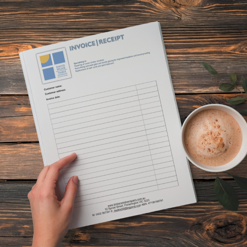
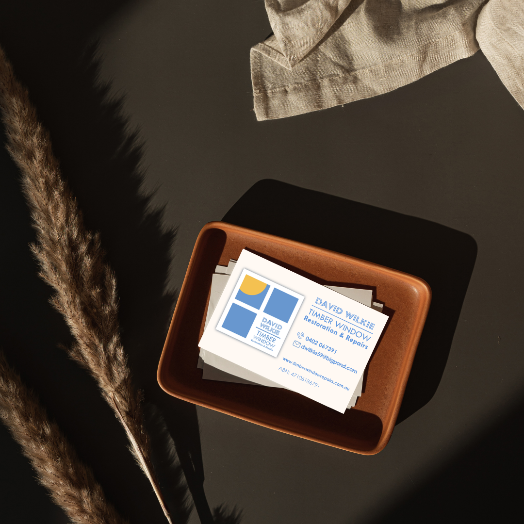
Brand collateral. I designed matching templates for David's invoices, quotations and receipts, plus new business cards, all carrying the new logo, so his brand looks consistent and professional across every customer touchpoint.
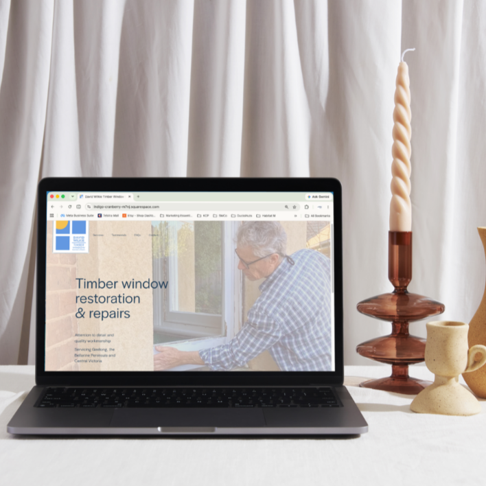
Website design and build. Wireframes, a mood board and a full build in Squarespace, designed to present David's information professionally and let his work speak.
Copy and content. I gave David a set of questions to draw out his background, his services, his values and the regulatory details his site needed, then drafted all the copy for the site from his answers. I also encouraged him to gather testimonials from past clients, since these do so much to reassure a prospective customer.
Photography direction. Pam kindly offered to photograph David at work and in his workshop and did a beautiful job. The images capture his professionalism and skill, and they carry a lot of the site's credibility.
Technical delivery. I coordinated the backend and domain transfer, which took a few calls to the hosting provider to get right, and handled the testing and launch.
“Samantha was always available when needed, communicated clearly and provided creative and effective solutions for our new website. Her technical know-how meant she was able to cover all the IT requirements, offering us a complete service. Samantha’s friendly, respectful and professional manner made her someone we were very pleased to work with. We have no hesitation in recommending Samantha.”
The outcome
The new brand and site present David's craft the way it deserves to be seen, professional and consistent across everything from his website to his invoices. Combined with a memorable, search-friendly web address, it works hard to bring the right customers to him.
The clearest sign of its success is a happy problem. Since the site went live, David has been in such high demand that he's had to close his books to new enquiries more than once, just to keep up with the work. For a specialist trade, that's about the best outcome there is.